Healix App
Overview
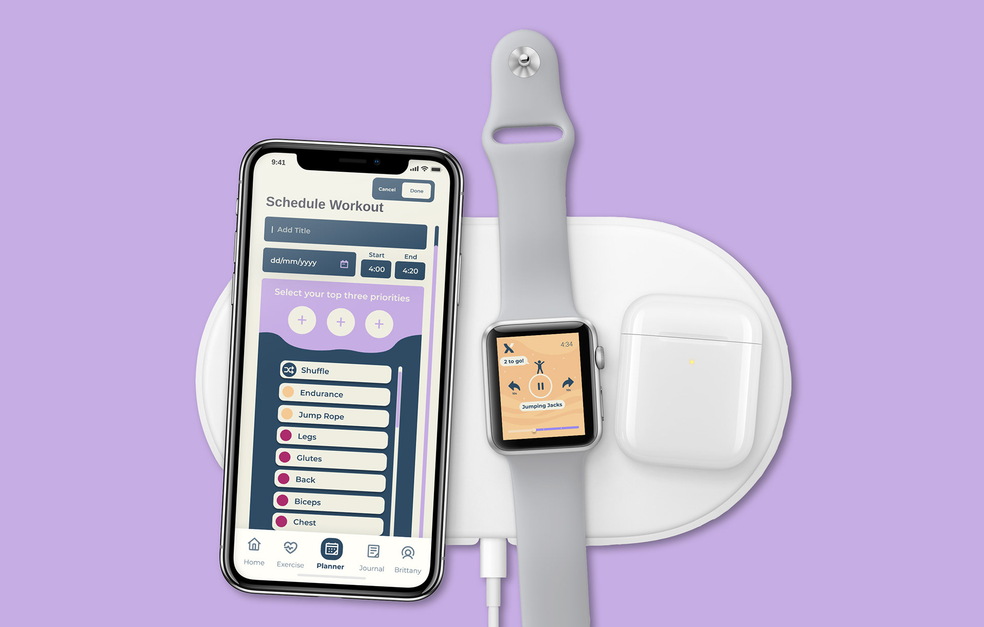
In light of COVID-19, it is hard for many of us to get beneficial exercise under quarantine. Healix is an exercise phone and watch app which was designed to promote physical and mental health through an immersive audio experience in the space of your own home. This was completed as part of an University project and placed first in the Unit.
Timeline: 3 months
Tools: Figma, Adobe Illustrator, Balsamiq, Adobe Photoshop, Miro
Challenge
Design an interface that promotes physical activity at home.
Goals
• Encourage a holistic approach to health with a defocus on body image
• Ease of usage and convenient
• Make home work outs engaging
Purpose
The purpose of was to design an interface that helps promote users to do physical activity at home as part of their daily schedule.
___
🏆
First in cohort for DECO2102 Web Design
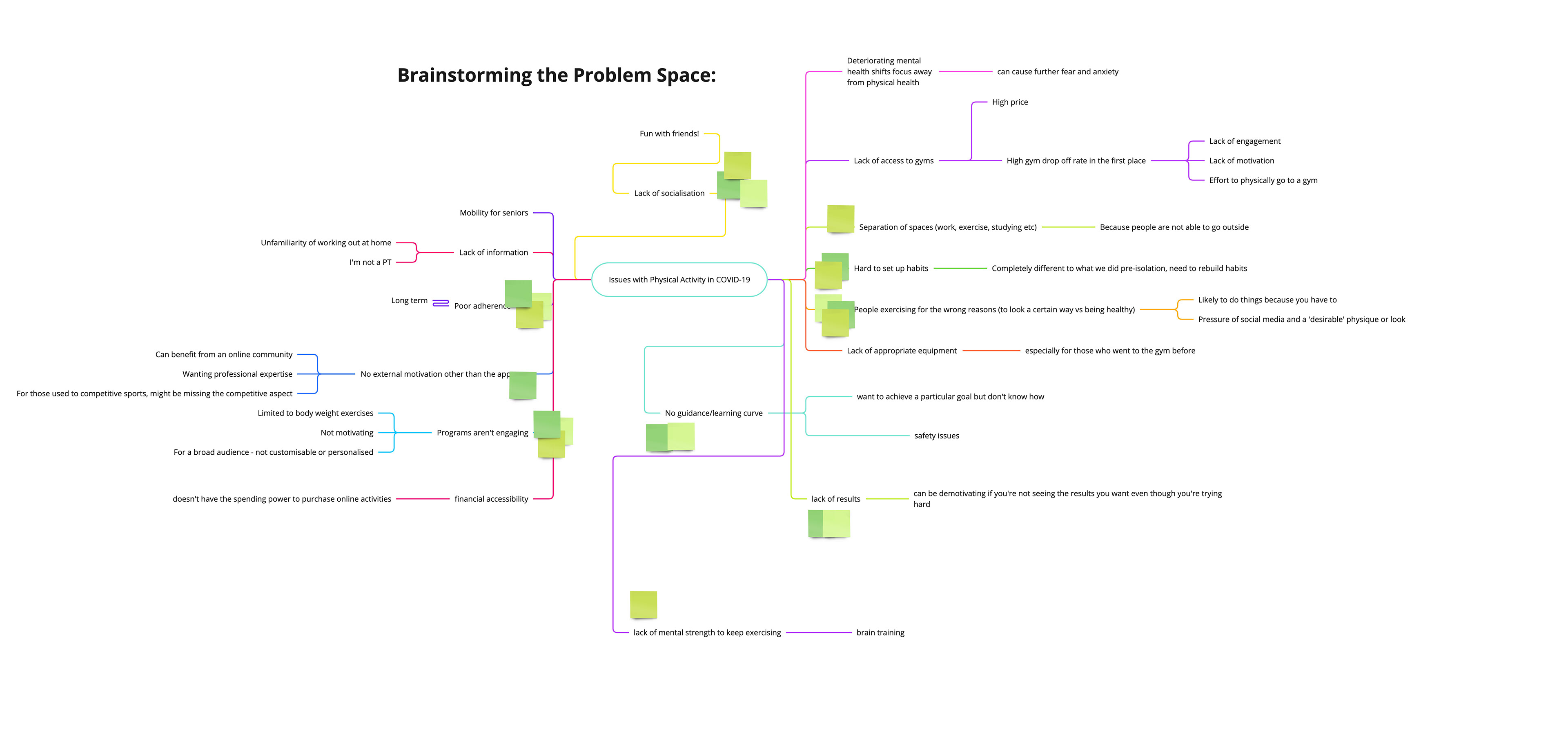
Research
Background Research to Understand the Problem Space
To gain greater understanding of the problem space, context and issues, we conducted extensive secondary research across multiple platforms: academic literature, fitness blogs, news outlets and direct competitor website. Through analysis of key market trends and design precedents, I was able to develop my skills in critically identifying relevant information.
These were then used to form a mind-map on Miro, loosely based on the 5 Whys technique to define an underlying root cause (Tomitsch et al., 2018).
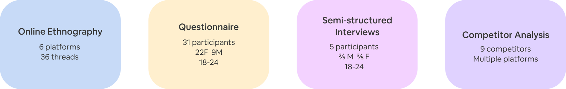
Primary Research to Empathise with User Needs and Motivations
We sought to understand the current experience of home fitness apps, and investigated core user needs, motivations and frustrations. By undertaking primary research, I could delve into broader areas of research topics to identify true user problems and needs. I was able to develop my primary research skills through exposure to research participants and data gathering and extraction methods.
Data Synthesis
An affinity diagram was used to identify and distill overarching themes, in order to uncover the big issues that users would face.
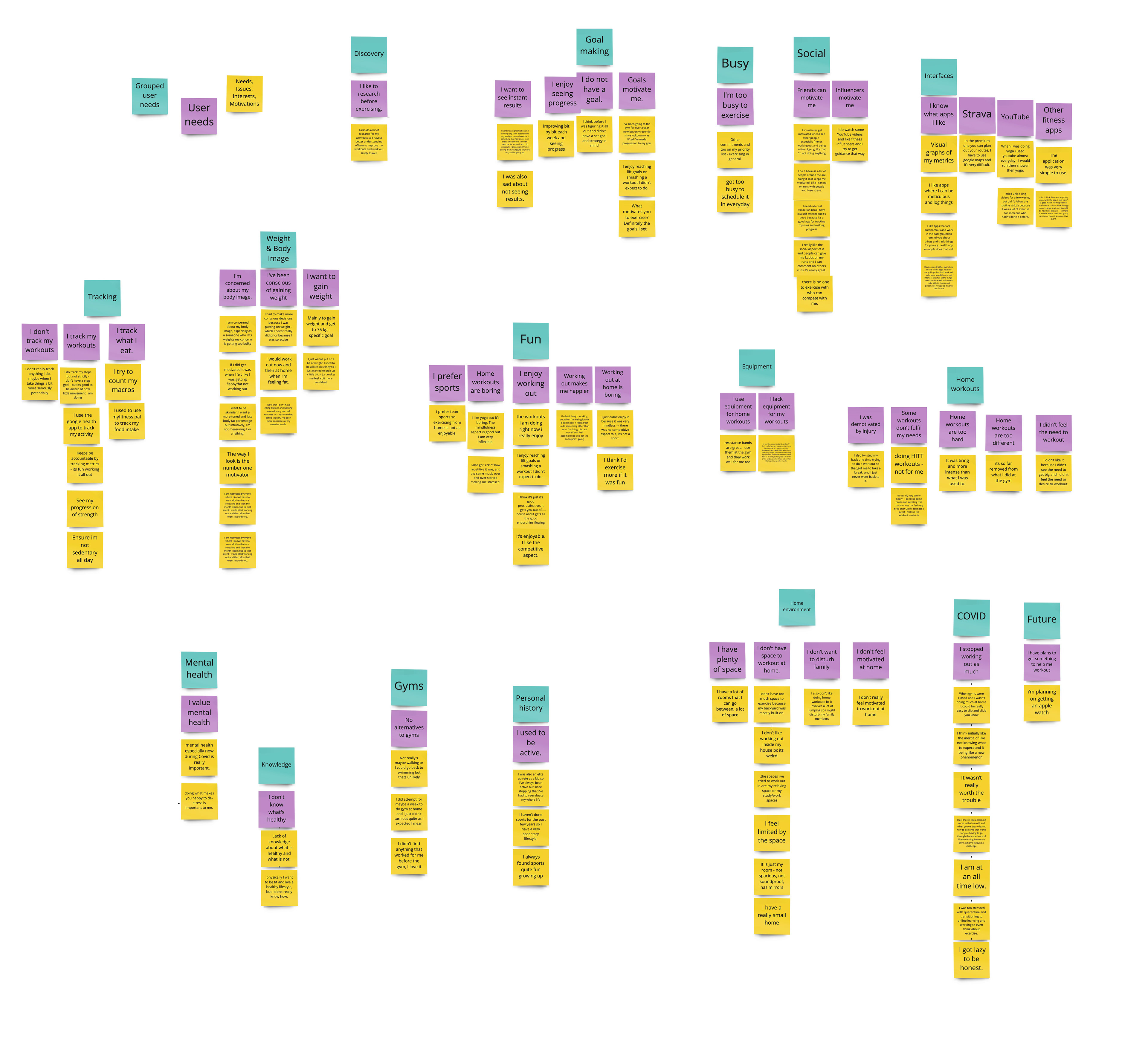
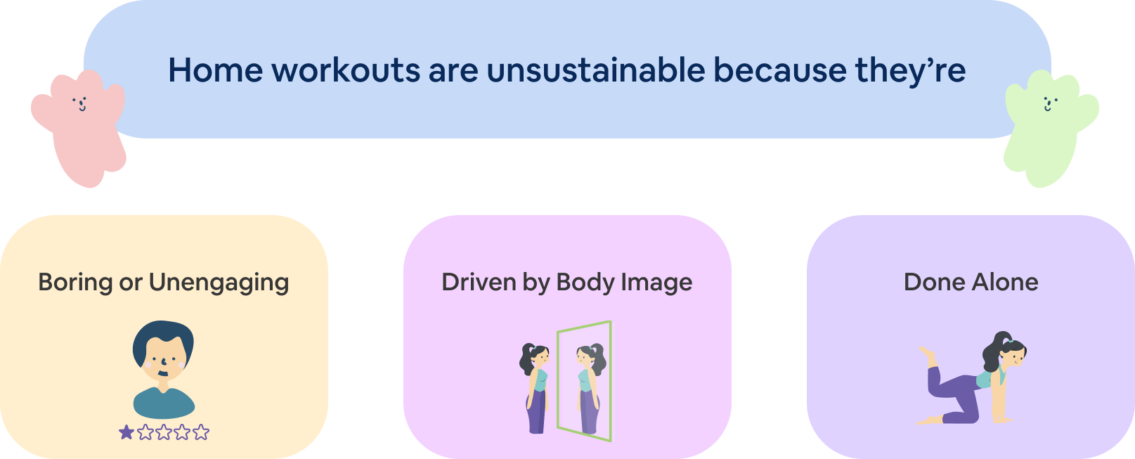
From all our research we were able to converge to a key problem area. Under this we identified 3 further problem areas that were a root cause of this problem area.
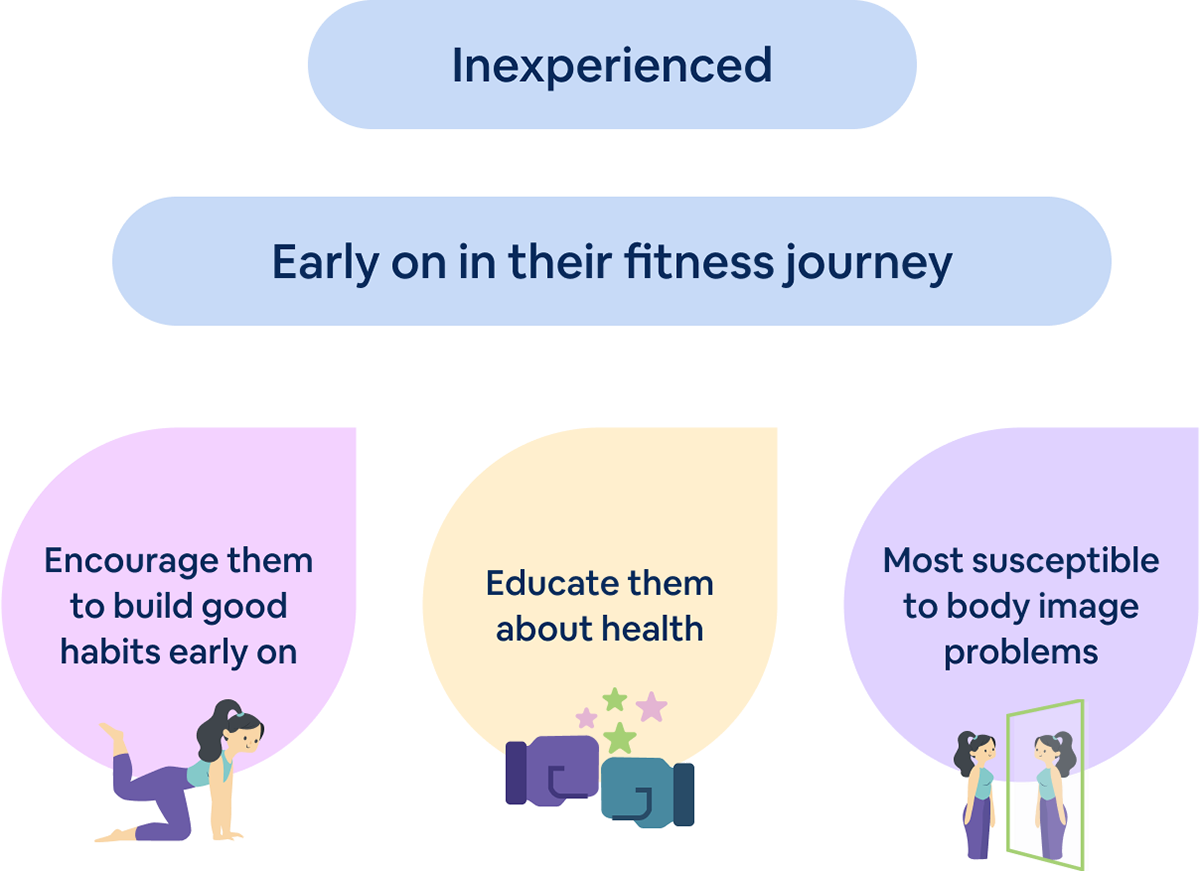
Target User
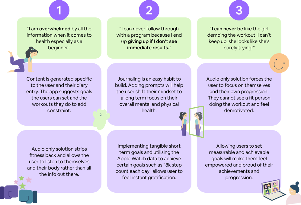
Drawing upon the data gathered from our primary research, we determined that a screen based solution to target female Gen Z users. Although body image image is a problem experienced by all genders, females more evidently struggle with it.
“I can never be like the girl demoing the workout. I can’t keep up, she looks like she’s barely trying!”
Interviewee 2
“I can never follow through with a program because I end up giving up if I don’t see immediate results.”
Interviewee 4
Within the target market we identified a more specific subject whom would benefit the most out of our potential design solution. They include females who are:
Ideation
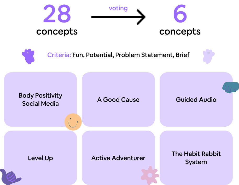
Ideation techniques of Brainwriting and Crazy 8 were used to rapidly generate 28 concepts, allowing us to think more creatively under time pressure to come up with unique and interesting ideas. Through discussion, we built of each other's ideas, forming more holistic concepts through a more collaborative approach. Using a voting system, we narrowed down the ideas to 6.
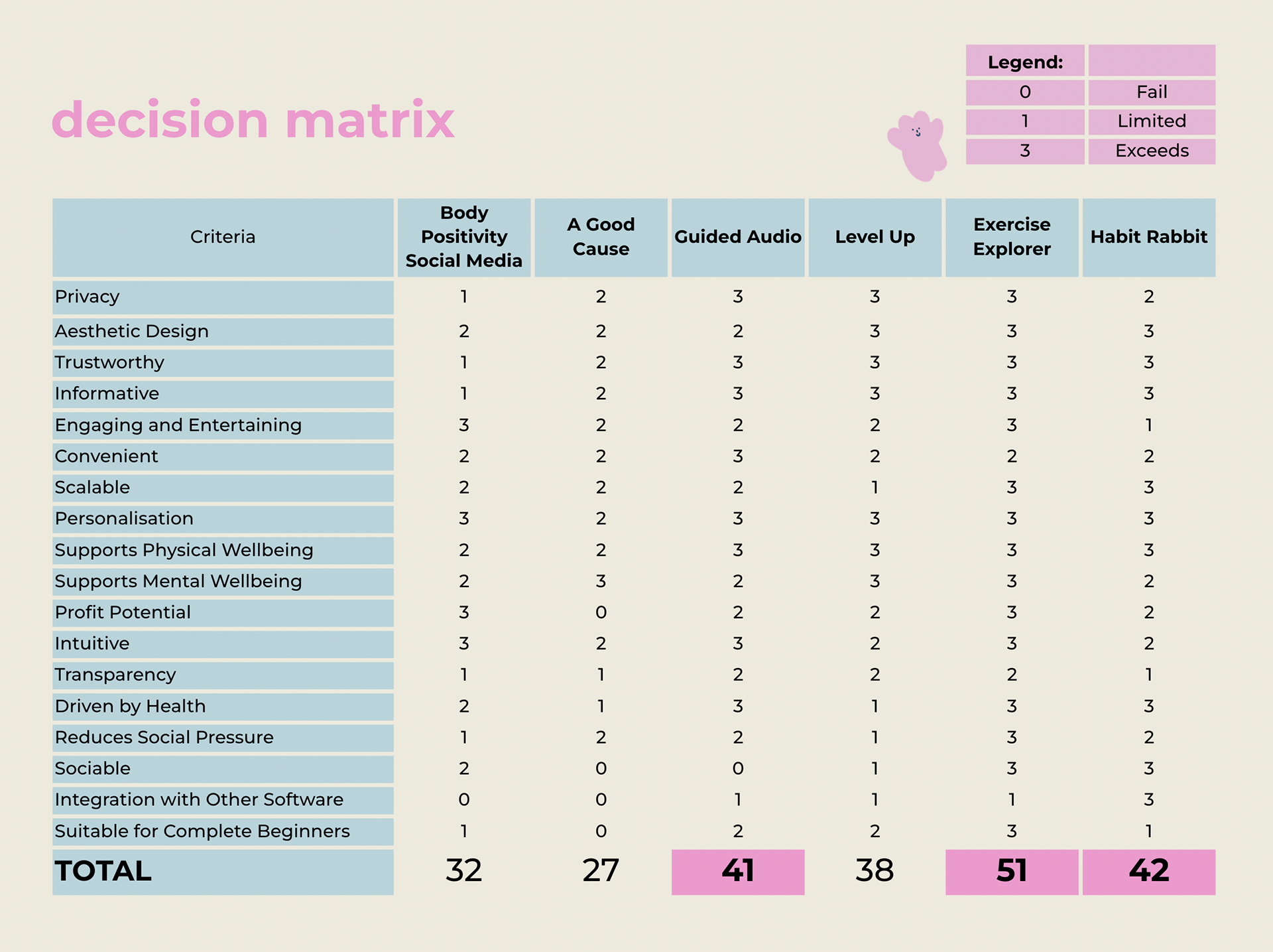
After voting, we decided to further evaluate our top 6 ideas with a decision matrix. With the brief in mind, we created a criteria to rank each idea. Through the utilisation of a design matrix, we could determine the top three best solutions with the least amount of conflict.
Sketching
(2 rounds)
This round of sketching focused on drawing up relevant home screens to showcase how each concept would manifest in an app. We then internally made suggestions which would be implemented in a new round of iteration.
Wireframing
(2 rounds)
We then used Balsamiq to flesh out our three concepts as low-fi wireframes, providing clearer visualisations of our concepts. It also made user testing more possible, with a user working their way through each screen. Don Normans’ Interaction Principles and Gestalt Laws were used to justify UI decisions.
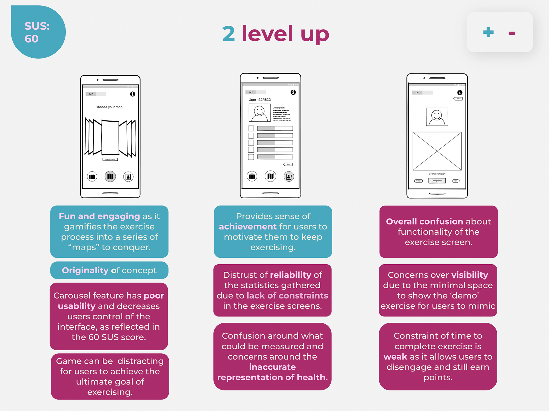
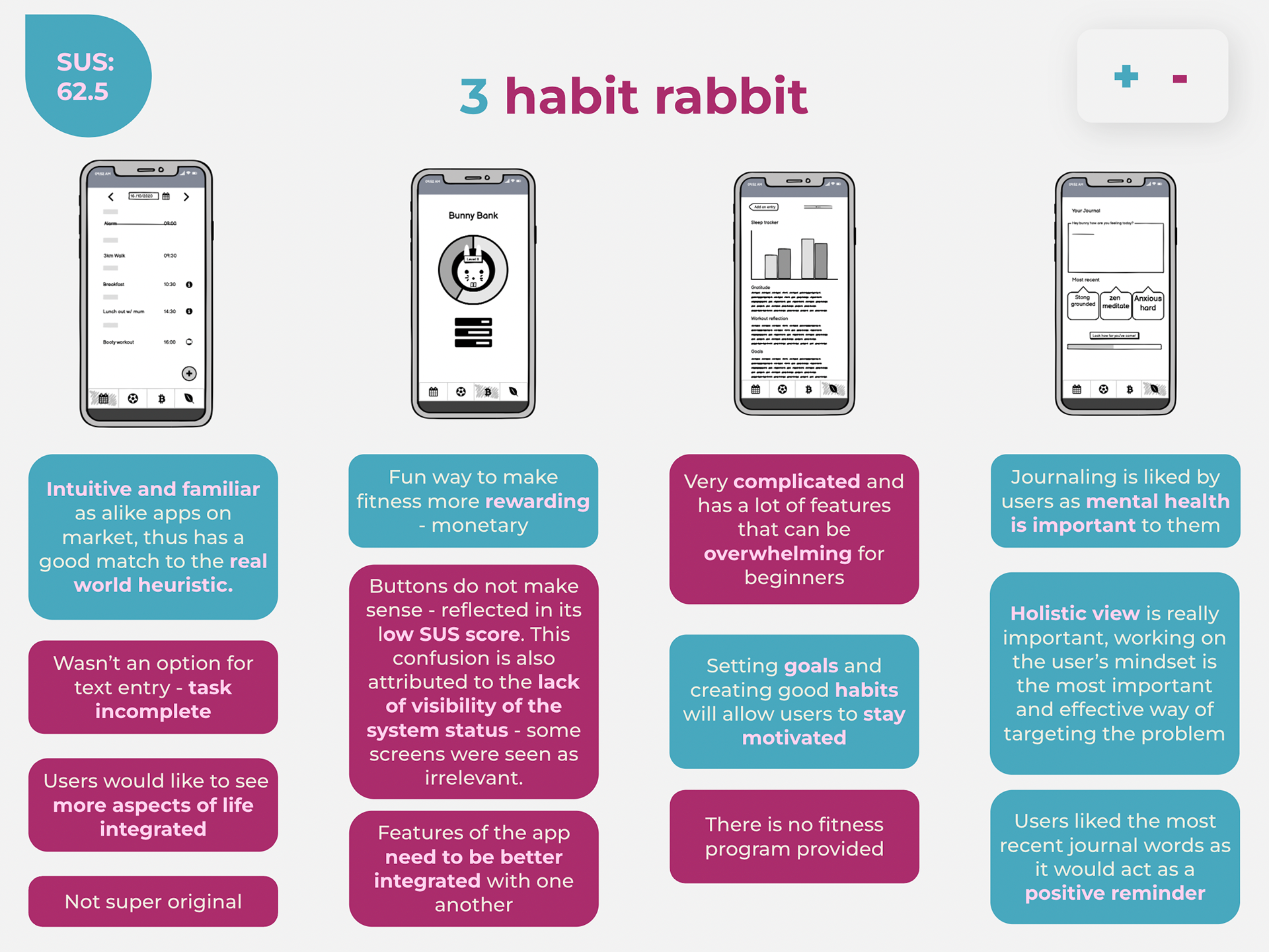
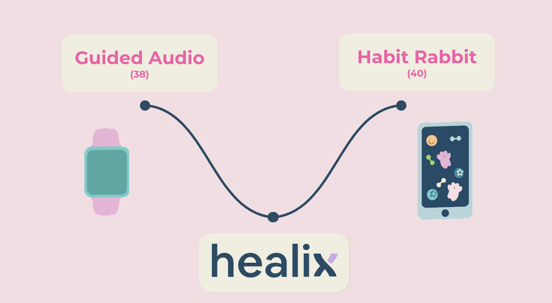
Concept Redevelopment
The evaluation matrix and user testing results saw potential in both Guided Audio and Habit Rabbit, with both scoring the highest. Combining the applications may overcome the limitations of each concept; Habit Rabbit was unoriginal and didn’t have a huge fitness focus - missing the brief; and Guided Audio was too simple - not having much to expand on due to the limitation of the Apple Watches’ very small 38-44mm screen. Guided Audio takes the focus away from body image by avoiding comparison to the person demoing and Habit Rabbit can actually target the body image issue through getting users to internalise their feelings and emotions.
Revisiting the Brief & Problem
We also revisited the brief at this stage, verifying whether our solution was well suited to the problem at hand. We found that the apps allowed for flexibility and efficiency of use as the system can cater to both inexperienced and experienced users. We hope to have answered a problem relevant for any user that uses the platform. Furthermore the app allows for customisation which allows users to tailor frequent actions to their liking.
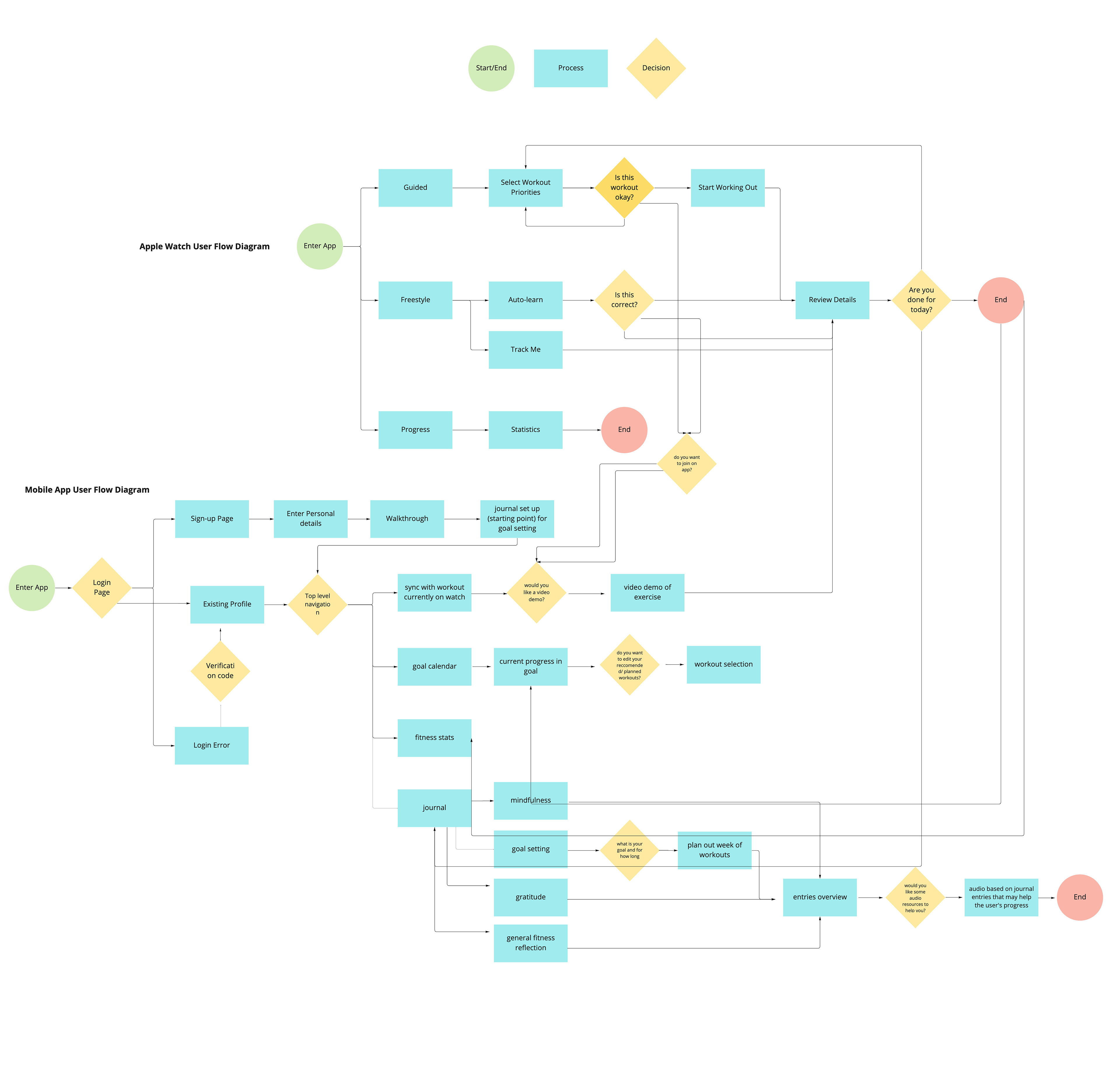
User Flow Chart
Flow charts were then created for both the Apple Watch and mobile app, linking together the different screens and sections that would create our interfaces. This approach of systems thinking offered the following benefits:
• Ensure that we understood how both the platforms would be used in tandem
• Illustrate the main flow between screens (Yoo, 2020); if the user clicks a button where will it take them?
• Enables smooth collaboration between the 3 designers so we have the same understanding of the user journey
• Figure out if screens were useful in the overall concept, defined a purpose of a screen and how it affects another
• Show alternate paths - but not all paths
Low Fidelity Prototypes
(2 rounds)
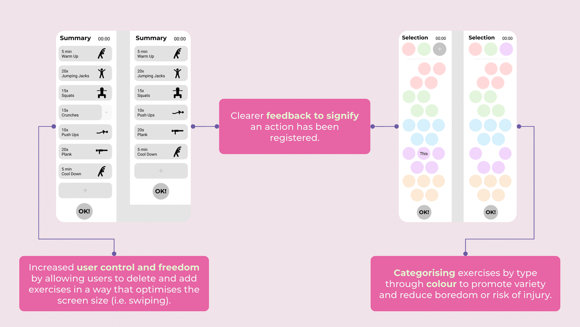
By moving away from wireframing through Balsamiq and onto prototyping on Figma, we increase the fidelity and introduced interactivity to our apps. As such creating realistic interface designs and interactions on Figma provided an immersive, realistic experience for users to interact with in our usability testing.
This iteration focused on implemented the changes identified from our wireframing and increasing usability. Connectivity to the apple watch was kept at the forefront. Gestalt laws of proximity and closure (Yoo, 2020) were also used to convey information easily to users and also imply they needed to scroll.
Apple Watch
Mobile Phone
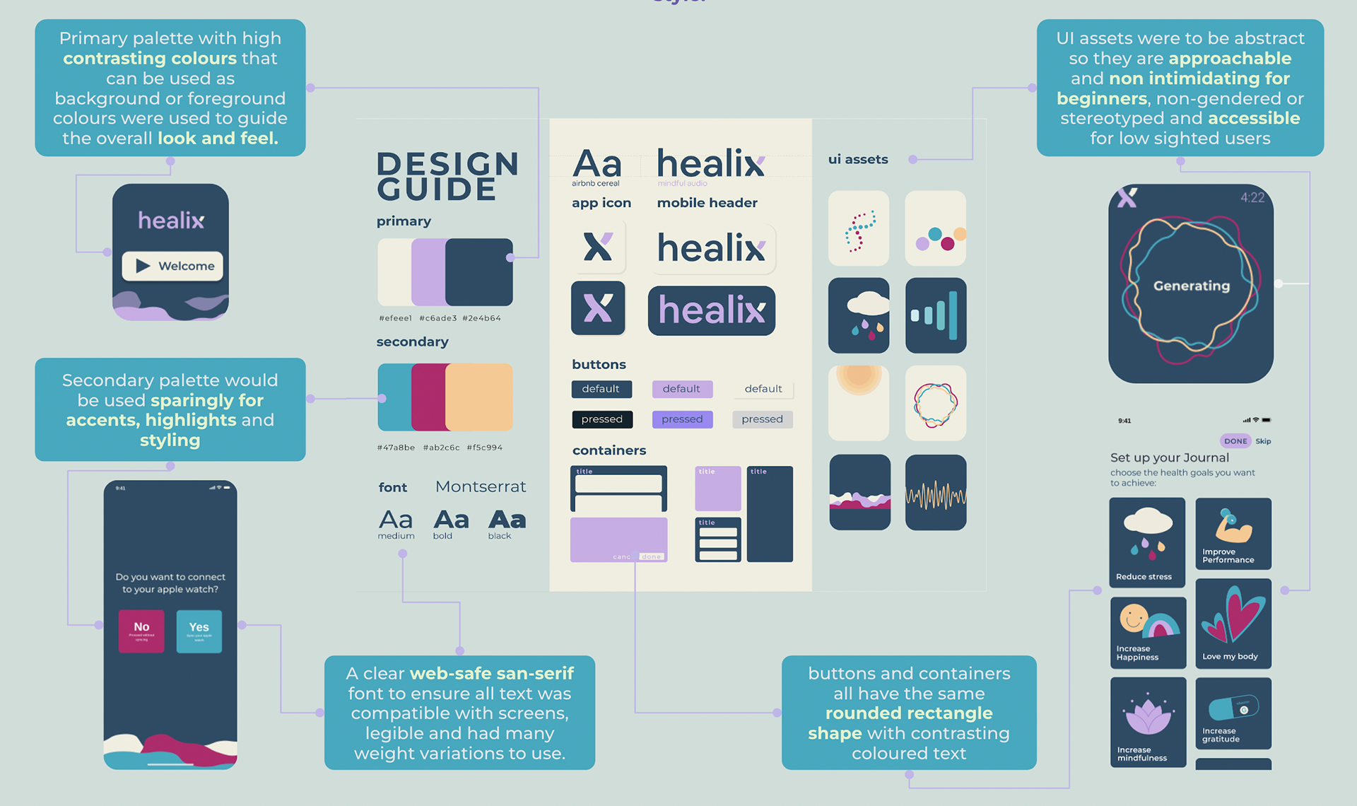
UI Style Guide
Styling was developed through group voting and discussion. The following guide was made to ensure platform consistency (Yoo, 2020) between devices, as we needed to design for two types of screens, we wanted to employ a minimal style.
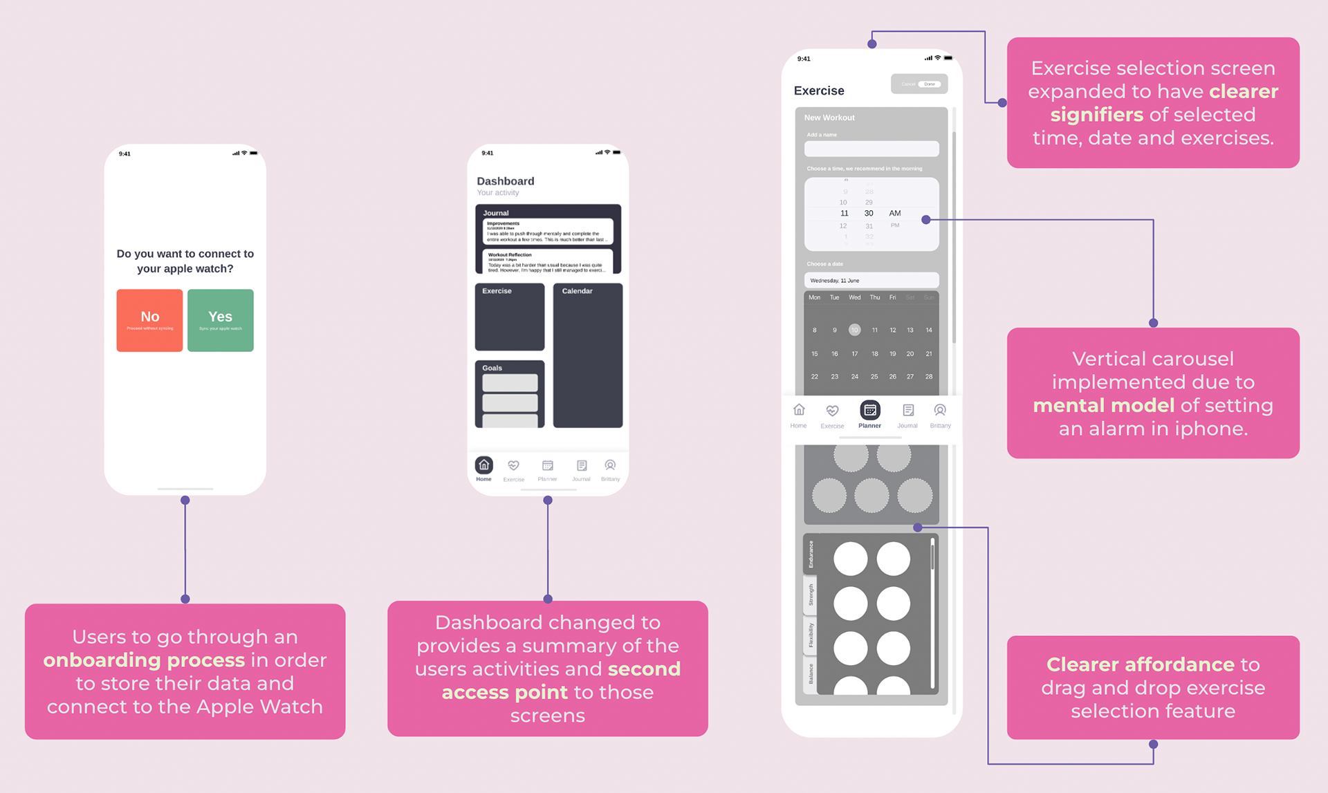
High Fidelity Prototypes
(2 rounds)
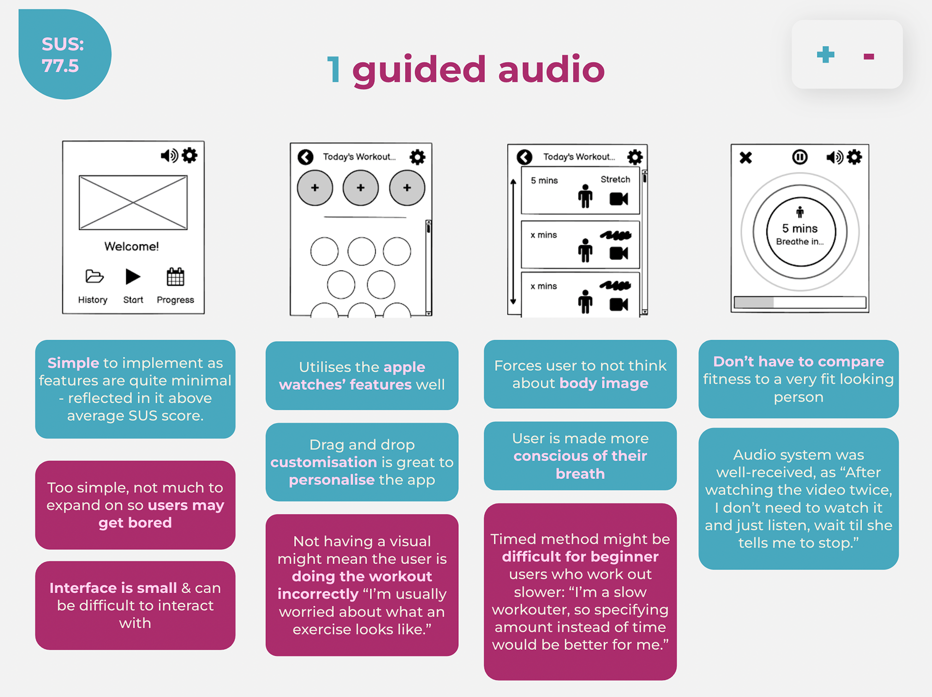
Implementing feedback from user testing and an internal SUS test, we created our final prototype.
User Testing
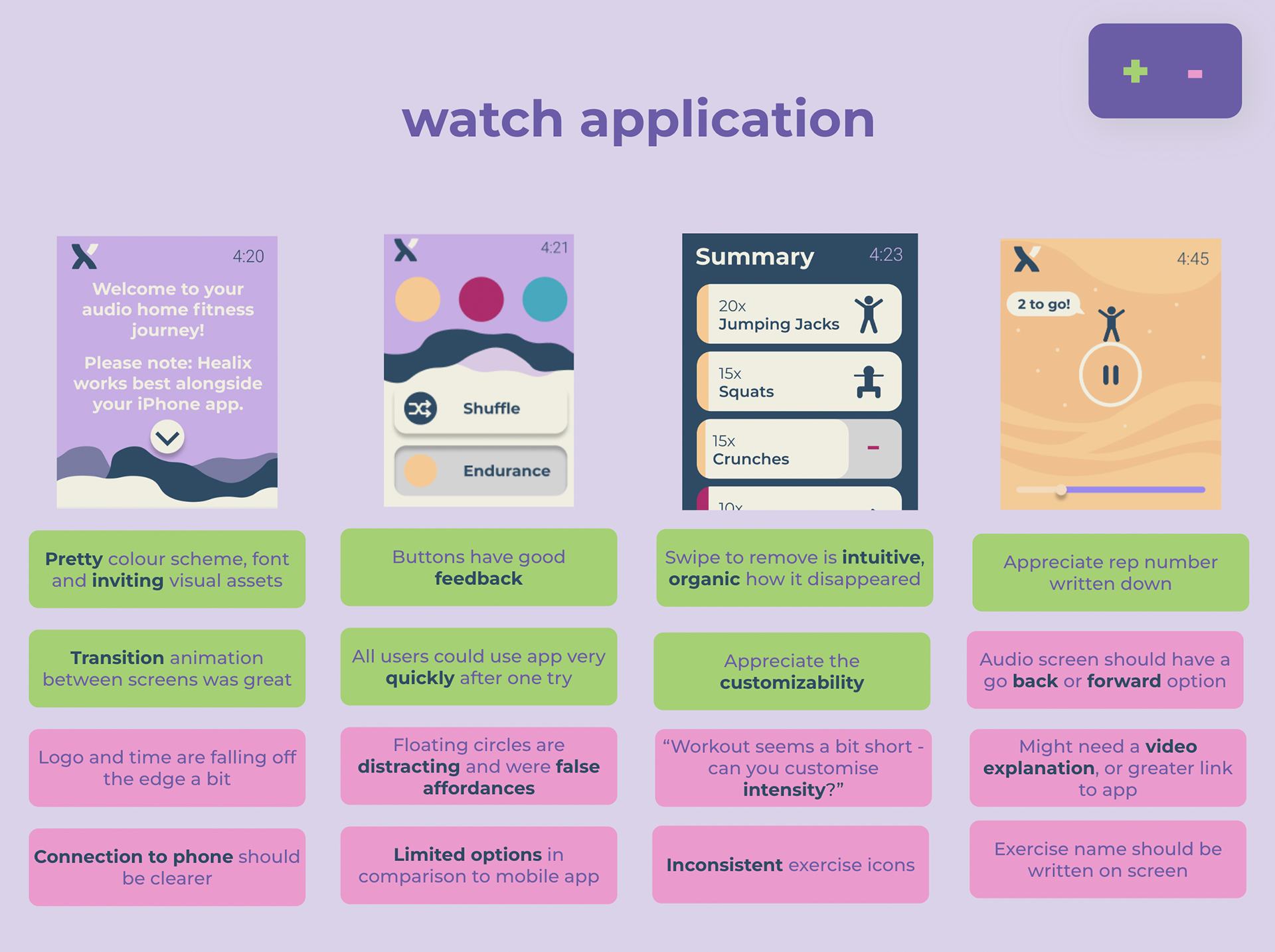
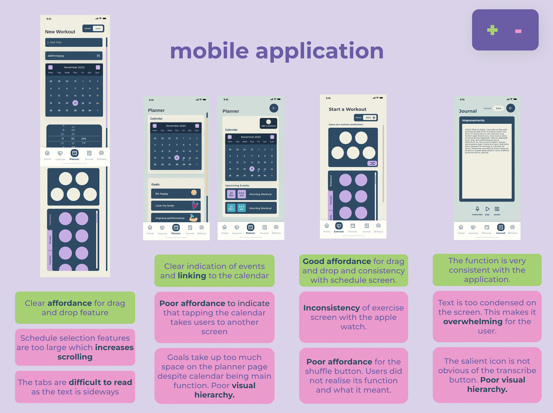
User testing was conducted at each stage in order to determine issues in interactions, user flow and behaviours. For each round of testing, users were tested with the first application with think aloud protocol. After the test, they were shown the second application. SUS testing and Heuristic evaluation were then internally conducted.
Users: Similar to the user testing conducted for our low fidelity prototypes, the users were chosen based on our identified target market, Gen Z females who are inexperienced and early on in their fitness journey. Users were tested with one application and shown the second application.
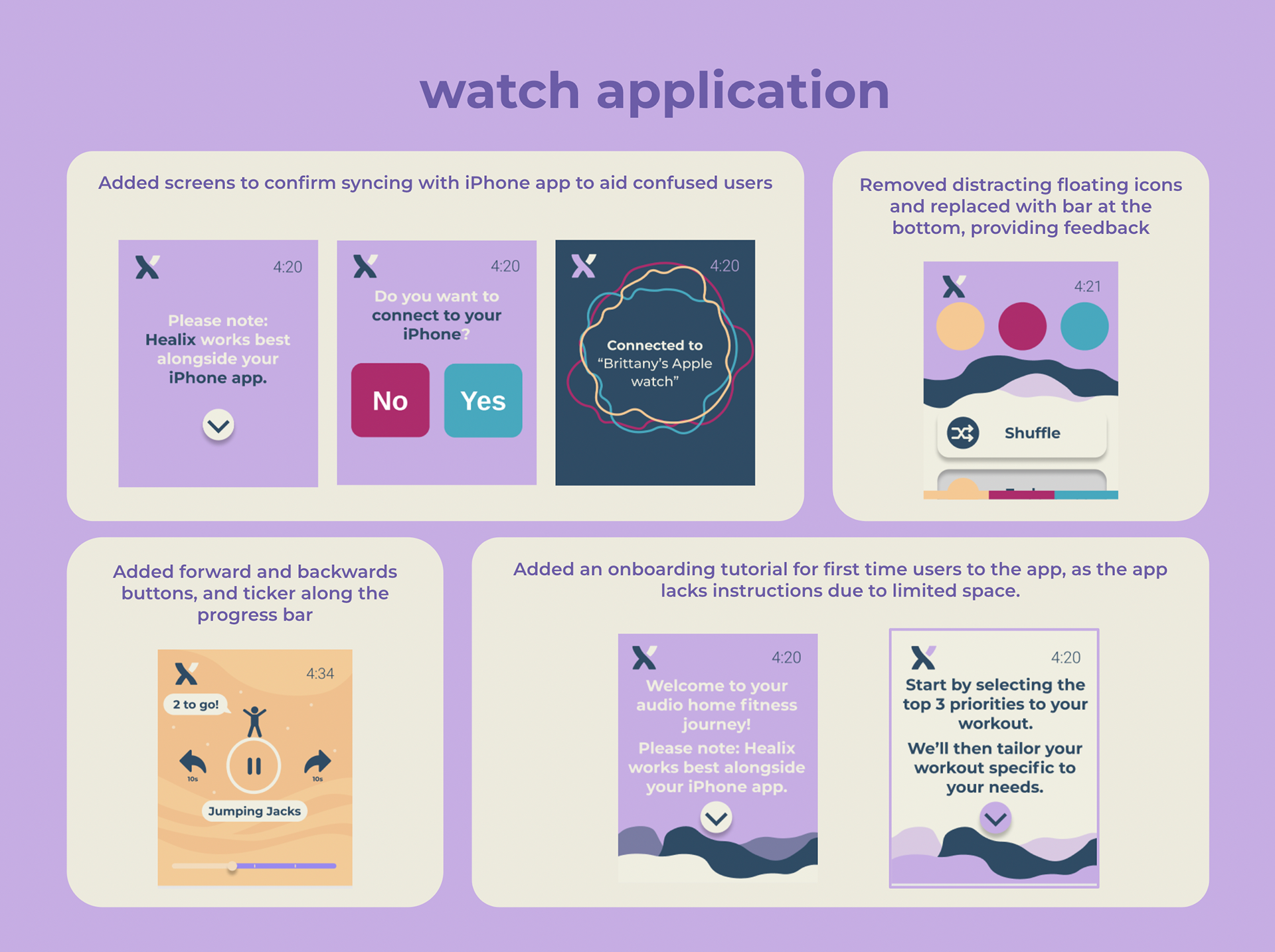
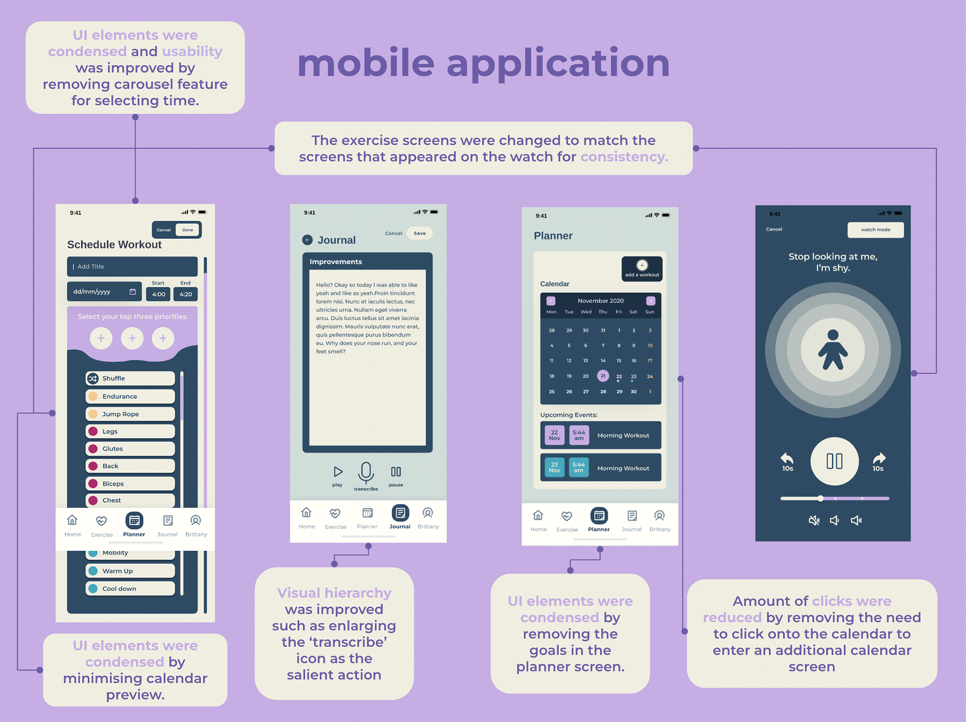
Final Concept
From a final round of testing, we developed our final concept. Both applications focused on better connectivity between the watch and the phone. Features were also made more consistent across the two platforms.
Key Learnings
Design Methodologies & Technical Analysis
Analysing usability using heuristic evaluation revealed insights that we did not pick up on using our intuition.
Have fun with your work
A key learning that I've taken on to my other projects is to take the time to have fun. Not everything needs to be super efficient all the time, sometimes taking the time during ideation to draw a frog together makes the entire process so much more fun, allowing for overall productivity.
"Frog", 2020
Digital Art
Representative of how 3 design students felt when trying to come up with a project idea
Digital Art
Representative of how 3 design students felt when trying to come up with a project idea